Colour Wheel: How to Use Colour Wheel to Pick Perfect Colour Palettes & Schemes?
Colour Wheel: How to Use Colour Wheel to Pick Perfect Colour Palette
Ever wondered how great artists design masterpieces? Whether it’s an advertisement, invitation card, painting on canvas, fashion, film, or photograph, how do they achieve the right balance of attraction and aesthetic? Is it all a random amalgamation of drawing, colour and design? Or, is there scientific backing to the creation of great works of art?
One of the most important factors in design is choosing the right colour combinations. These duos of hues grab attention towards the designs and works of art that they are a part of. This is one of the most primary functions of colour. When different colours work together, they make a colour combination. This is also known as a colour scheme.
That is all well and good for professional artists and designers. However, what about those people who are not experts? How can they learn about colours and their combinations? For all the answers, we must look to the colour theory and colour wheel. Both of these tools are the most effective ways to find attractive colour combinations that will create the desired effect in your work of art.
What Is Colour Wheel?
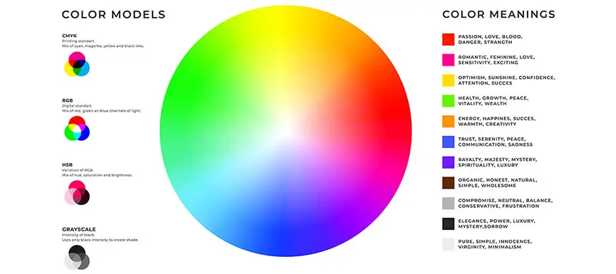
The colour wheel is an essential aspect of colour theory. Simply put, it is a visual representation of the entire spectrum of colours available to us. A circular graph showcases all the primary, secondary and tertiary colours in their various forms.
Here it gets more interesting. The colour wheel helps us create colour catalogue and colour schemes by displaying to us the various hues, tints, tones and shades of every primary, secondary and tertiary colour. We will discuss each of these concepts in detail later on in this article. This visual charting of all the various forms of each colour gives us a world of options to choose from. Its main purpose is to assist us in creating colour schemes for our colour catalogue design and art.
Also read: Wall Paint Colour Catalogue & Latest Colour Shade Card
When you get this visual help from a comprehensive circular graph, it becomes easier to choose brighter, lighter, softer and darker colour palettes. It also gets easier to see each colour in context to the next one on the rainbow colour scale. As you look at the colour wheel, you will notice that the colours are distributed as per the order of the colours of the rainbow: red, orange, yellow, green, blue, indigo, and violet.
What Is Colour Theory?
In this day and age of information abundance, we are constantly exposed to a variety of content in magazines, on television and online. While the text of most of this information is important, it is unlikely that it will be the first thing to grab our attention at first glance. Most people would agree that striking visuals like infographics, pie charts, illustrations, and images which employ the use of attractive colours are most likely to catch our eyes first.
So, how can you use the power of colour to your advantage? For this, we must understand the basics of colour theory.
Colour theory is the blueprint of the basic rules and principles of using colours in design. Once you understand these ground rules, you can begin making sense of the logic of colour and use it effectively to produce the right kind of reaction from your final target audience.
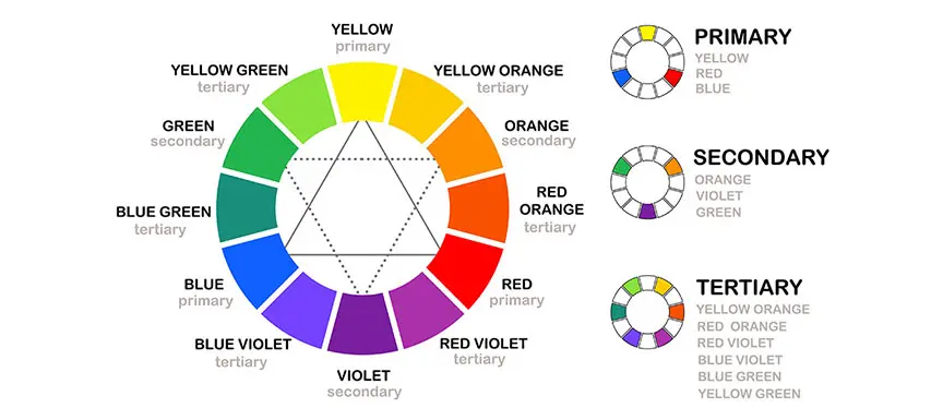
Primary, secondary and tertiary colours make up the essence of colour theory. Primary colours are those that exist without being created by combining two or more colours. Secondary colours are made by combining two primary colours while tertiary colours are formulated by combining primary and secondary colours. We will discuss the different types of colours in detail a little later in this article.
The guidelines provided by colour theory assist us in making effective colour combinations to create the right kind of design or artwork that meets our end goal. We can better understand this process by looking at the colour wheel.
Here Is a Comprehensive Explanation of The Various Kinds of Colour Combinations.
It is safe to say now that colour and their combinations can make or break the success of your design. If you are an advertiser or marketeer, you want that right combination that makes your campaign a success. If you are a fashion designer, you want to break the shackles of monotony and create a trend. If you are a graphic designer, you want to find the right combination to create a striking visual for your project.
If you are just starting out or an expert in the field, here is a cheat sheet for you. Look through these types of colour combinations to know how you can crack the code and make a loved design or piece of art with these different types of colour combinations. Whatever be your endeavour, these guidelines will help you choose the right colours.
-
Complementary Colour Combinations
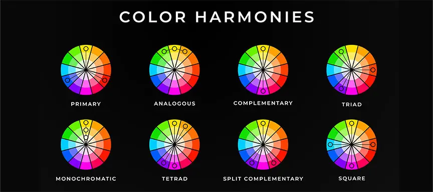
A complementary colour combination involves colours that are opposite to each other on the colour wheel. This kind of combination makes for an intense and invigorating effect. They are also known as supplementary or contrasting combinations. Due to the fact the colours used are opposites of each other, they usually create a bold look.
-
Triadic Colour Combinations
As its name suggests, the triadic colour combination uses three colours to create an effect of contrast in any design. The three colours are equidistant from one another on the colour wheel. The speciality of this kind of combination is that it is vivid even when you use light or pastel colours.
-
Analogous Colour Combinations
This colour combination involves using two to five colours that sit next to each other on the colour wheel. This combination creates a soothing effect on the viewer. Usually, in such a colour scheme, one colour is the dominant one, the other supports the first colour and the third one usually creates an accent.
-
Tetradic Colour Combinations
The tetradic colour combination involves four colours: one primary, two complementary and a fourth colour that accentuates the design.
Let us explore the world of colours more. We now know what the colour theory, colour wheel and various colour combinations are. Let’s get to the details of the various kinds of colours that make up these concepts.
-
What are primary colours?
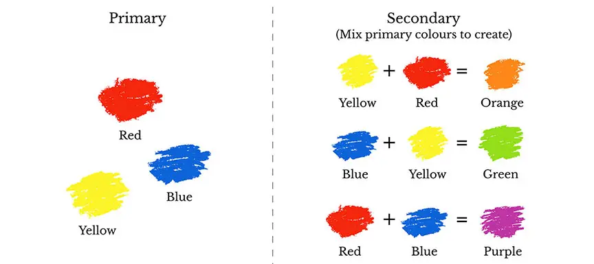
Drawing inspiration from the term primary, think of prime numbers: they cannot be calculated by multiplying two numbers together. Similarly, primary colours cannot be created by combining two or more colours. There are three primary colours: red, yellow and blue.
Consider primary colours to be your guiding light in the design. When you pick these colours, you can choose which variants of these colours you want to use for your whole design. Primary colours are used by themselves or in combination to make other colours.
-
What are secondary colours?
When two primary colours are combined together, secondary colours are created. Orange, purple and green are the three secondary colours. This is how they are made:
Red + Yellow = Orange
Blue + Red = Purple
Yellow + Blue = Green
It is helpful to know which primary colours combine to make each secondary colour as they provide clues into which colours go well with the secondary colour. It is also important to note that secondary colours can be made only with the purest form of the primary colours.
-
What are tertiary colours?
These colours are made when a primary colour is combined with a secondary colour. This widens the scope for any design you create because now you have more colours at your disposal.
It is important to note that not all primary and secondary colours can combine to make a tertiary colour. For example, red and green do not make any kind of colour that is aesthetically pleasing. The same goes for blue and orange. The resultant colour of these two combinations makes an odd tone of brown which is not workable.
See also: Two colour combination for bedroom walls
So, what is the secret of making tertiary colours? The answer is simple. When a primary colour is mixed with a secondary colour that is adjacent to it on the colour wheel, a tertiary colour is made.
Here are the tertiary colours along with their components:
Red + Purple = Red-Purple (magenta)
Red + Orange = Red-Orange (vermillion)
Blue + Purple = Blue-Purple (violet)
Blue + Green = Blue-Green (teal)
Yellow + Orange = Yellow-Orange (amber)
Yellow + Green = Yellow-Green (chartreuse)
-
What are warm colours?
When you think of the concept of warm colours, you have to consider the ‘colour temperature’. Look at the colour wheel and you will see a mix of ‘warm’ and ‘cool’ colours. Warm colours are those from red through yellow on the colour wheel. They give you the literal feeling of warmth, just like when you soak in the sun. As per colour psychology, warm colours provide a sense of energy and enthusiasm.
Warm colours are more about the feelings they create in the target audience than their actual temperature on a thermometer.
-
What are cool colours?
Alternatively, when you consider ‘colour temperature’, you will note that there are certain colours that seem ‘cool’ on the colour wheel. These colours give you the soothing sensation similar to when you run your hands through cold water. On the colour wheel, cool colours are those from blue to green and purple. In terms of colour psychology, cool colours provide a sense of tranquillity and seclusion. Cool colours are all about the sensation they create.
-
What are hues, shades, tints and tones?
‘Hue’ can be used interchangeably for ‘colour’. In essence, it is the purest form of a primary or secondary colour. A hue has the fewest elements inside it. When you want to formulate the hue of a secondary colour, you will need to use the hues of the two primary colours to ensure you get the most unadulterated result.
A shade of any colour is formed when you add black to its hue. We often use the term ‘shade’ to refer to lighter or darker versions of the same colour. However, the more accurate explanation involves how much black you add to that colour.
Tints are the polar opposites of shades. When you add white to any hue, you make its tint. Keep in mind that you can actually have a spectrum of shades and tints of any given colour because of the amount of black and white used respectively.
Tone, also known as saturation, is achieved when both black and white are added to a hue.
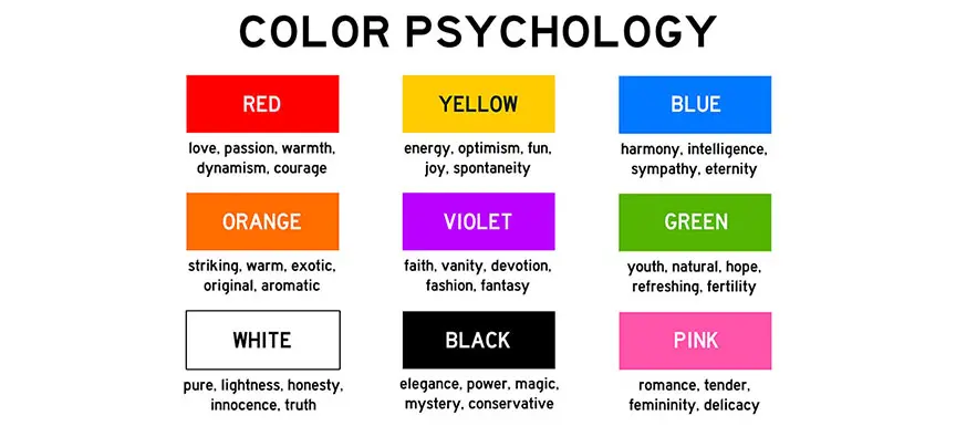
How Important Is Colour Psychology In Design?
Colours and their various tints, shades and tones evoke specific feelings in those who view them. When you are creating any art, fashion, illustration, logo, advertisement, infographic, movie or photograph, the play of colours is important to hold and grab attention.
Further, since colours dictate visual appeal, they must be used to effectively grab attention toward the design. For businesses and also artists who create art for art’s sake, using specific colours means that they are communicating certain messages to their audience.
Scientific research has proved that colours convey subliminal messages to audiences. There are various mood-altering features of different colours and this can be used to the advantage by graphic designers when it comes to businesses and commercial art.
Take the example of greeting cards, romantic cards will have designs in colours that communicate love and compassion. Logos of industrial companies will have colours that communicate strength and rigidity. Doctor’s clinics may use colours that evoke a sense of calm to patients. Restaurants may choose to use a mix of warm and cool colours to convey a sense of gastronomic pleasure. Some brands use colours that are eye-catching simply so that they can cut through the clutter when it comes to similar products.
Some popular colours and what they stand for:
-
Green: This secondary colour stands for Mother Nature, a sense of security and the great outdoors. Green promotes creativity. Ecological companies, outdoors- and nature-inspired companies, health clinics can use green in their designs.
-
Blue: The primary colour blue is one of the most accepted and popular colours by the general populace. Ability, intelligence and a sense of duty are associated with blue. Trust and efficiency are communicated by the colour and that’s why you will see it being used by finance and tech companies.
See also: Colour Combination with Blue
-
White: Peace, purity and simplicity are some of the virtues of white. Wellness companies and health clinics can use the colour to convey cleanliness and hygiene.
-
Red: The primary colour red is used in colour palettes of designs to give a sense of strength, action, and excitement. Retail companies do well with this stimulating colour that tends to stand out.
See also: Red Colour Combination
-
Orange: Fitness companies and logistics firms will benefit from using the colour orange because it stands for energy, enthusiasm, and vigour.
-
Yellow: This primary colour is considered to give off a cheery and playful vibe. Firms that want to communicate a welcoming sense of friendliness can incorporate yellow in their communication.
See also: Colour Combination with Yellow
-
Pink: Toyshops and beauty companies can use pink in their designs as it promotes compassion, warmth and a nurturing feeling.
-
Black: Though a stark colour, black is perceived as a stylish colour that is used to represent glamour and sophistication. This is why fashion and automobile companies use it so much. Black also has a regale aura and stands for respect and majesty.
Now that we’ve delved deeply into the colour wheel and understood colour schemes and psychology, let us take a look at what colours combine and go well with the following colours.
-
White: Modern colour palettes use black and white with a touch of green. When mixed with any hue, like red, yellow and blue, white makes the respective tint of that hue.
-
Blue: Blue is wildly popular when it comes to all kinds of design and colour palettes. You needn’t look too far on the wheel to make an effective and striking colour scheme with blue. The hue does great when paired with its own shades, tints and tones. Blue, when e a primary colour, when mixed with yellow, another primary colour, makes green.
See also: Nerolac Colour Visualiser and Colour Palette Generator
-
Pink: The warm and nurturing colour, pink, when used in a softer and more subtle form, combines well with light blue and grey to create a bubbly and soothing colour combination. For a warm colour combination, pair pink with wood brown, yellow, and sunshine orange.
-
Grey: Grey may seem like a mute colour but it combines wonderfully with icy shades of blue to create a nice colour scheme that’s soothing to the senses. When combined with warm neutrals like brown and tan, it gives off an elite vibe.
-
Yellow: Make a complementary colour palette by pairing yellow with opposites red and green. Sometimes, this colour combination can be too bold so it is good to use the colours in their lighter versions. For a polished look, opt to pair yellow with grey.
-
Brown: For a delicious-looking combination, team brown up with red and violet. This colour combination works well for food menus and restaurants. Pair brown with yellow and olive green to create an earthy and warm colour palette.
-
Orange: Combine orange with navy blue and light and dark shades of grey for a professional colour scheme. For the lovely look of European-style autumns, opt for a pale orange with tomato reds, white and hot chocolate-inspired grey-brown.
-
Turquoise: For a pretty colour combination, pair turquoise with canary yellow, flowery pink and deep blue. For a unique colour palette that mixes warm and cool colours, go for turquoise, grey, brownish-purple and orange-red.
-
Green: For a lovely garden vibe, go for light and dark green to be paired with coral pink and cherry red. This colour combination is apt for designs trying to portray youthfulness.
See also: Green Colour Combination
-
Beige: This neutral colour provides a lovely backdrop for more stimulating colours. Combine it with grey, dark bluish-grey and mauve for a sophisticated and stylish look.
-
Olive: For a bright colour scheme, combine olive green with yellow, lime and orange. This will work for posters that want to grab attention. For a vintage vibe, go for olive with royal egg blue, deep red and orange-yellow nectar.
-
Lilac: Lilac, a soft type of purple, goes well with navy blue and grey to make a soothing and modern colour combination with clean lines.
-
Violet: A royal and soothing colour combination employs violet, lapis blue, coral pink and brinjal purple. Violet-grey, when paired with bright red, makes a sophisticated colour combination.
-
Cyan: The classic CMYK: cyan, magenta, yellow and black is the basis of most digital design. This colour combination can never go wrong and is great for a pop of colour akin to the lit-up neon sign boards in markets of cities.
-
Black: Black is a sophisticated colour that communicates glamour and eminence. When combined with white and grey, it makes for a modern and sleek colour scheme. Turquoise, ruby red, black and white make for a striking colour combination.
Colour psychology is important when we design anything or create art so that we can understand how our audience will perceive our work. It is a great marketing communication tool as well. Primary, secondary and tertiary colours form the basis of all the various hues that we can use for our colour palettes. When combining colours, look at the various types of colour combinations: analogous, complementary, triadic or tetradic.
We hope this article helped you understand which colours pair well with others to make attractive and beautiful colour palettes.
See also:
Nerolac Paints, a leading paint company in India offers a wide range of wall paint colours & painting services & solutions for homes & offices.
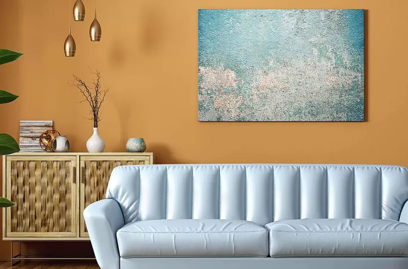
Colour Combination for Walls: 10 Beautiful House Colour Combination Ideas In 2023
A Guide To Trending Colour Combinations For Walls With Images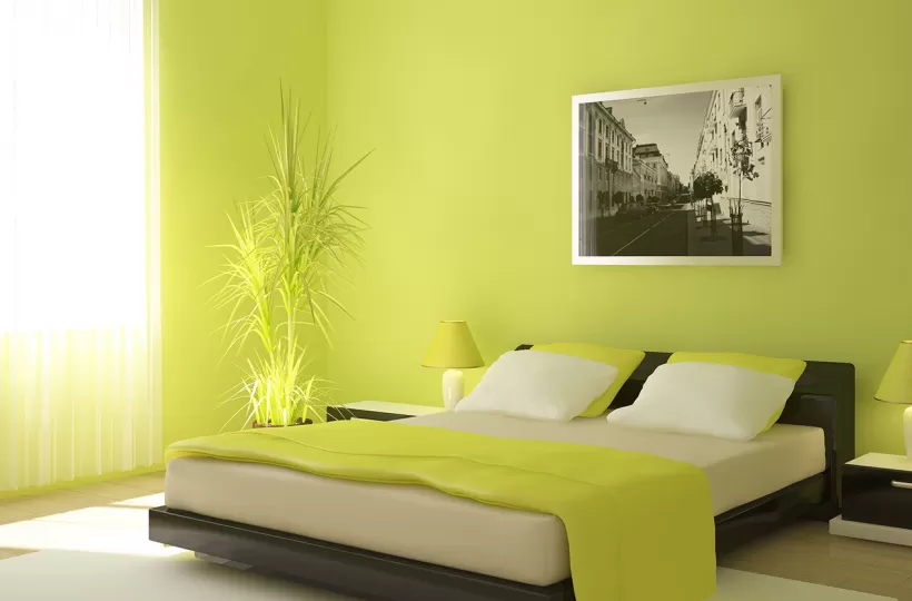
12 Stylish Green Colour Combinations and Photos
Green Colour Combinations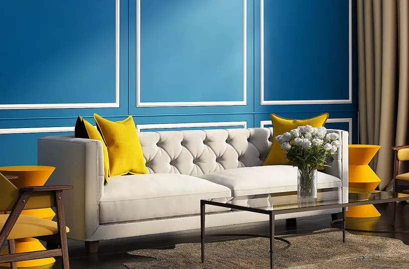
What Colours Match with Blue? 14 Colour Combinations with Blue for Your Home
Blue is a universally popular colour for décor and design
-
Recent Blogs
- Unlocking the Beauty of Simple Geometric Wall Paint: A Guide to Effortless Design
- Transforming your Space with Takcher Paint Design: A Guide to Texture Painting Walls
- Sitting Room Colour Combination: Discover the Perfect Palette for Your Space
- Revamp Your Kitchen with These Bright Wall Colors: Transforming Dull Spaces
- Kitchen Partition Designs that Enhance Your Living and Dining Space
Get in Touch
Looking for something else? Drop your query and we will contact you.
Get in Touch
Looking for something else? Drop your query and we will contact you.
Get in Touch
Looking for something else? Drop your query and we will contact you.

